

October 12, 2015
This update brings a
new visualization in CDD Vision, and more flexibility in setting scatter plot
scale ranges.
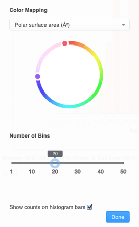
 You can adjust the number of bins, as well as add an additional color parameter to the histogram.
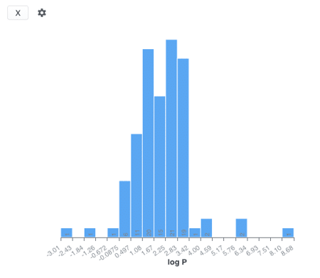
 The histogram visualization can be used just like the
side-bar filters to build a collection of molecules based on the selected data range. The scatter plot and histogram visualizations are dynamically linked, so when a selection is made in one plot, the other is updated automatically.
The histogram visualization can be used just like the
side-bar filters to build a collection of molecules based on the selected data range. The scatter plot and histogram visualizations are dynamically linked, so when a selection is made in one plot, the other is updated automatically.
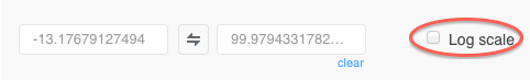
 The automatically adjusted ranges are populated by default, and you can use the interface to set the range manually. Clicking the double arrow icon will reverse the range, and the scale will be flipped.
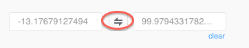 Select the "log" option to convert the scale to a log display.
Histograms
New histograms with automated binning allow for a quick assessment of data distribution that can be added side-by-side with scatter plots. You can adjust the number of bins, as well as add an additional color parameter to the histogram.
The histogram visualization can be used just like the
side-bar filters to build a collection of molecules based on the selected data range. The scatter plot and histogram visualizations are dynamically linked, so when a selection is made in one plot, the other is updated automatically.
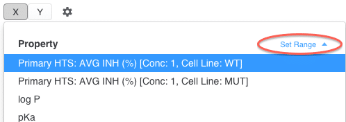
Axes Scale Ranges
Scatter plot scale ranges are set automatically when data are first loaded on the plot. With this release, we add the ability to manually adjust X and Y axes scales to show the data of interest. After the data are loaded, use the data series selections to make changes to the axes. The automatically adjusted ranges are populated by default, and you can use the interface to set the range manually. Clicking the double arrow icon will reverse the range, and the scale will be flipped.
Select the "log" option to convert the scale to a log display.