July 2, 2021
In 1972, singer/songwriter Johnny Nash achieved great success with these lyrics: I can see clearly now the rain is gone. I can see all obstacles in my way. Gone are the dark clouds that had me blind. In an effort to help you see data more clearly, our Development team has deployed a multitude of enhancements to the CDD Vault Visualization tool.
With Visualization enabled, users can pass numeric data directly from the CDD Vault search results table using the “Launch Visualization” button found in the actions header. Visualization is used to explore and present interesting correlations, and ultimately identify a subset of entities of interest.
The Visualization infrastructure has been upgraded and modernized, providing an excellent foundation for rapid improvement and deployment. New features will be released consistently over the coming months and we are eager to hear your feedback. Please give it a try and be sure to let us know.
Here is a summary of the new enhancements to date:
- Visualization now opens in a standard new tab within the same browser as CDD Vault
- Launch multiple Visualization sessions simultaneously
- Easily compare different data sets (search results) in side-by-side tabs
- Resize columns in the data table
- 150,000+ results can be dynamically visualized and filtered
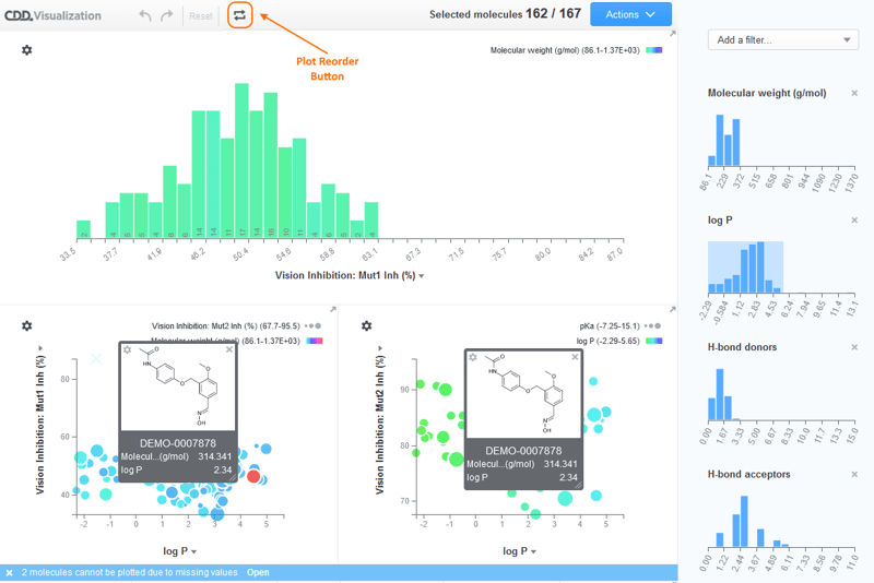
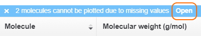
- View all data for points that have been “filtered out” in a separate table
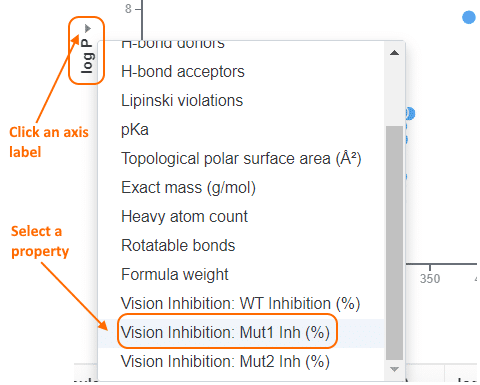
- Set axis variables, ranges and scale by clicking on the specific axis label
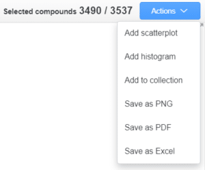
- A new “Actions” menu and a simplified sidebar with filters
- Add additional scatterplots
- Add additional histograms
- Create Collections back in CDD Vault
- Export plots to PNG, which you can easily drop into a PowerPoint slide
- Export plots to PDF
- Export the data table to Excel
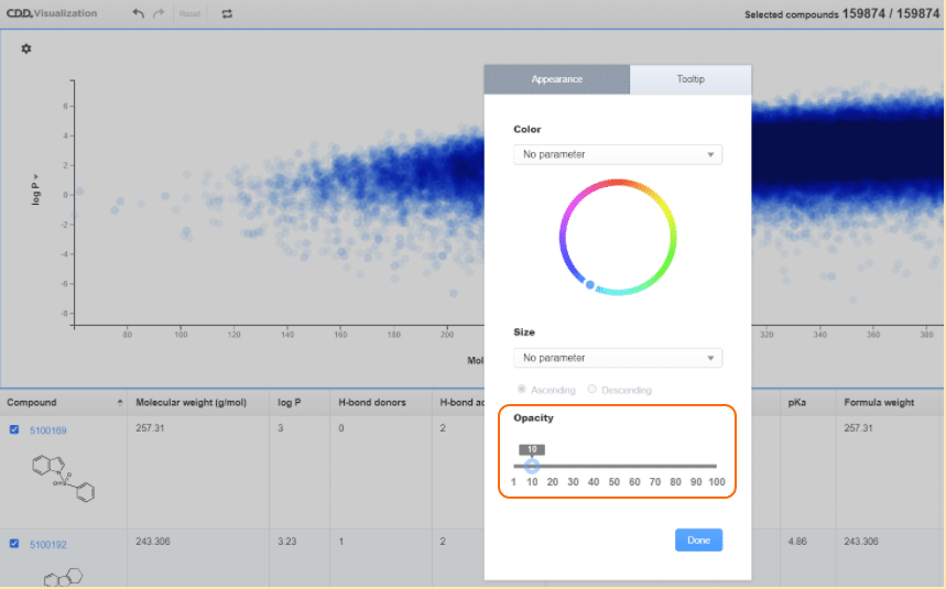
- New scatterplot “Opacity” setting, helpful for larger data sets with dense clusters of points
- Select the scatterplot Settings menu
- Slide the “Opacity” slider to the desired level
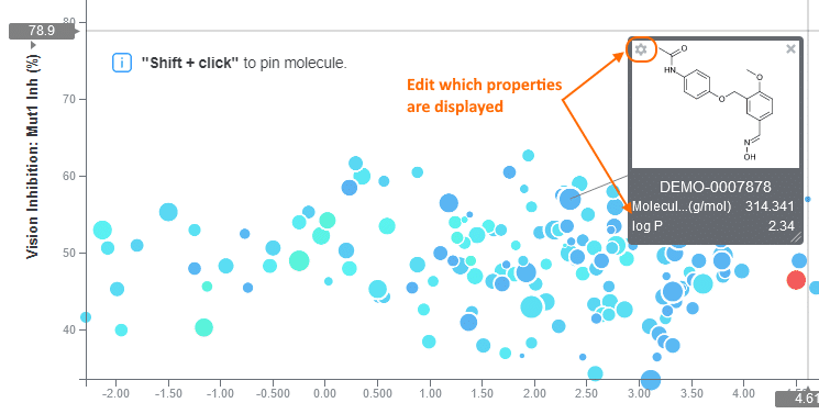
- Pin entity details on the plot so they persist
- Shift-Click on a data point
- Drag the pop-up box to the desired location
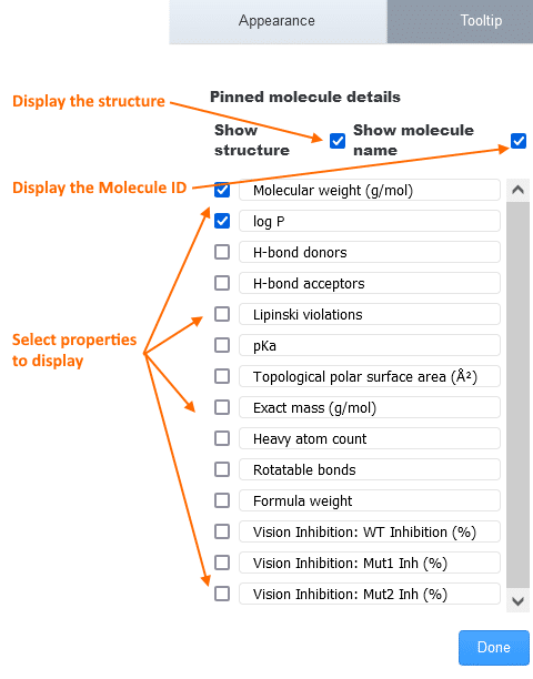
- Edit which details are displayed using the Settings menu within the pinned box or the plot Settings menu, Tooltip tab
- Use the Rearrange button to
- Drag plots to a new location
- Delete plots by clicking on the “X” in the top-right corner (while in the “rearrange” mode)